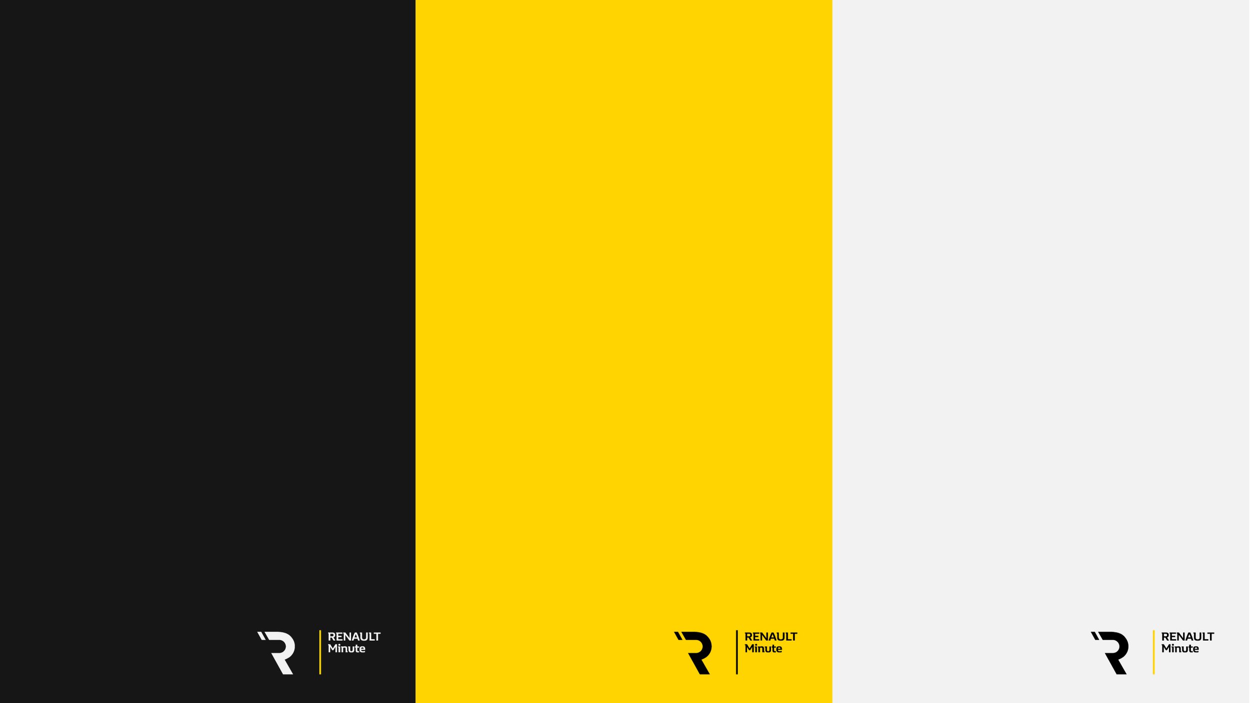
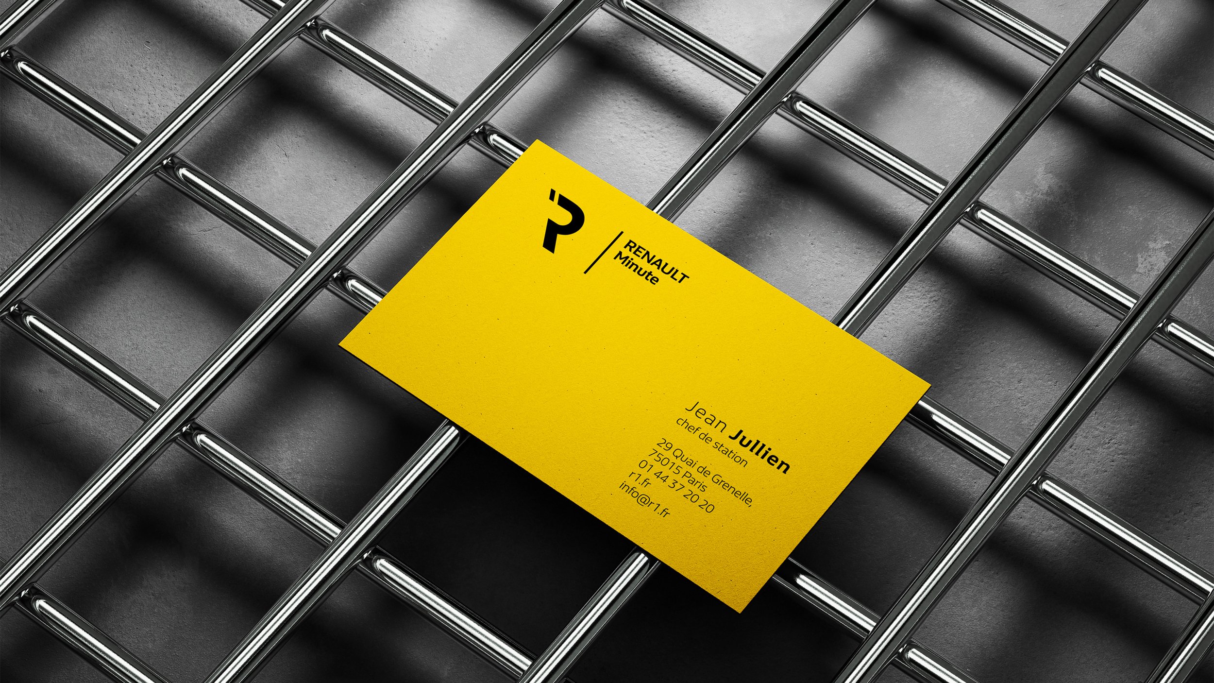
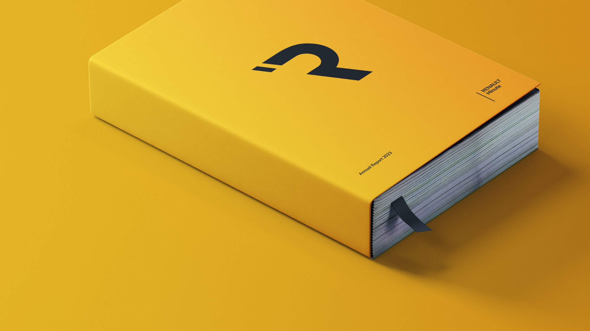
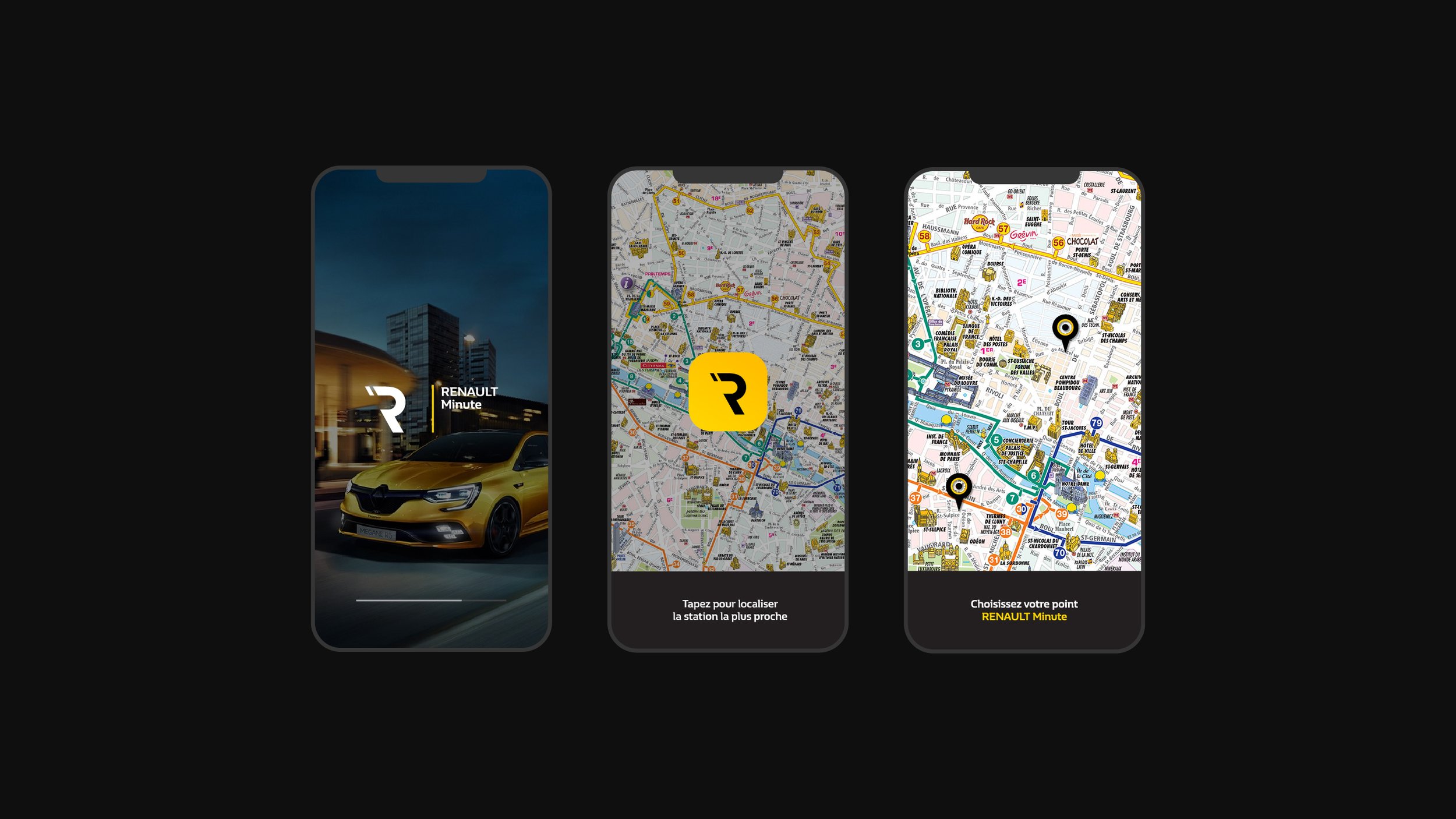
RENAULT Minute
Paris, France
Art direction, Brand identity, Logo design, Mobile app design
The Task
The french auto constructor was looking to modernise the image of its service stations called “Renault Minute” which they were finding it - outdated. The idea was to find a connection between a modern, sophisticated image with values as - trust, tradition, commitment, something that the clients were expecting from the brand. The promise.
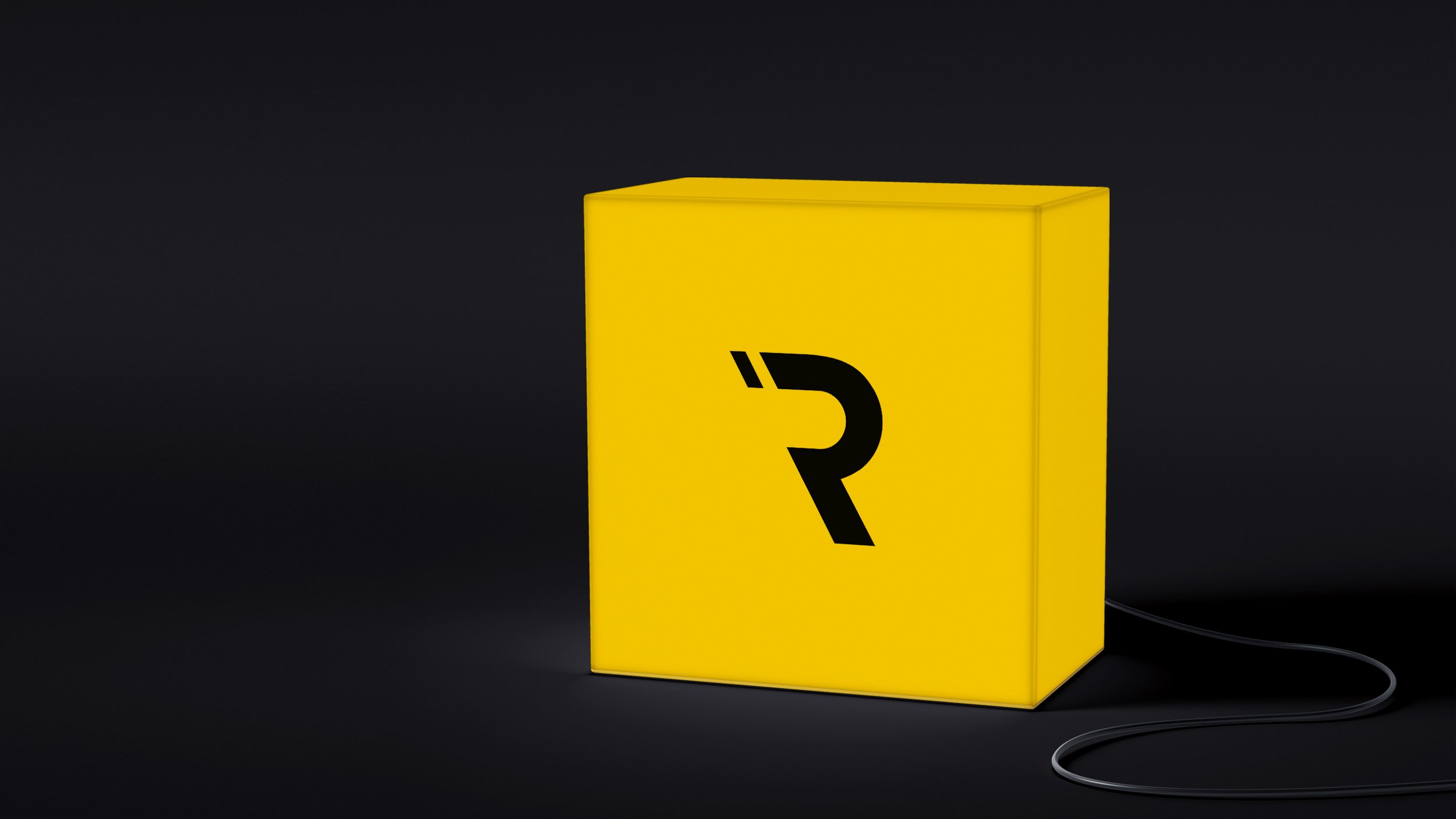
The Solution
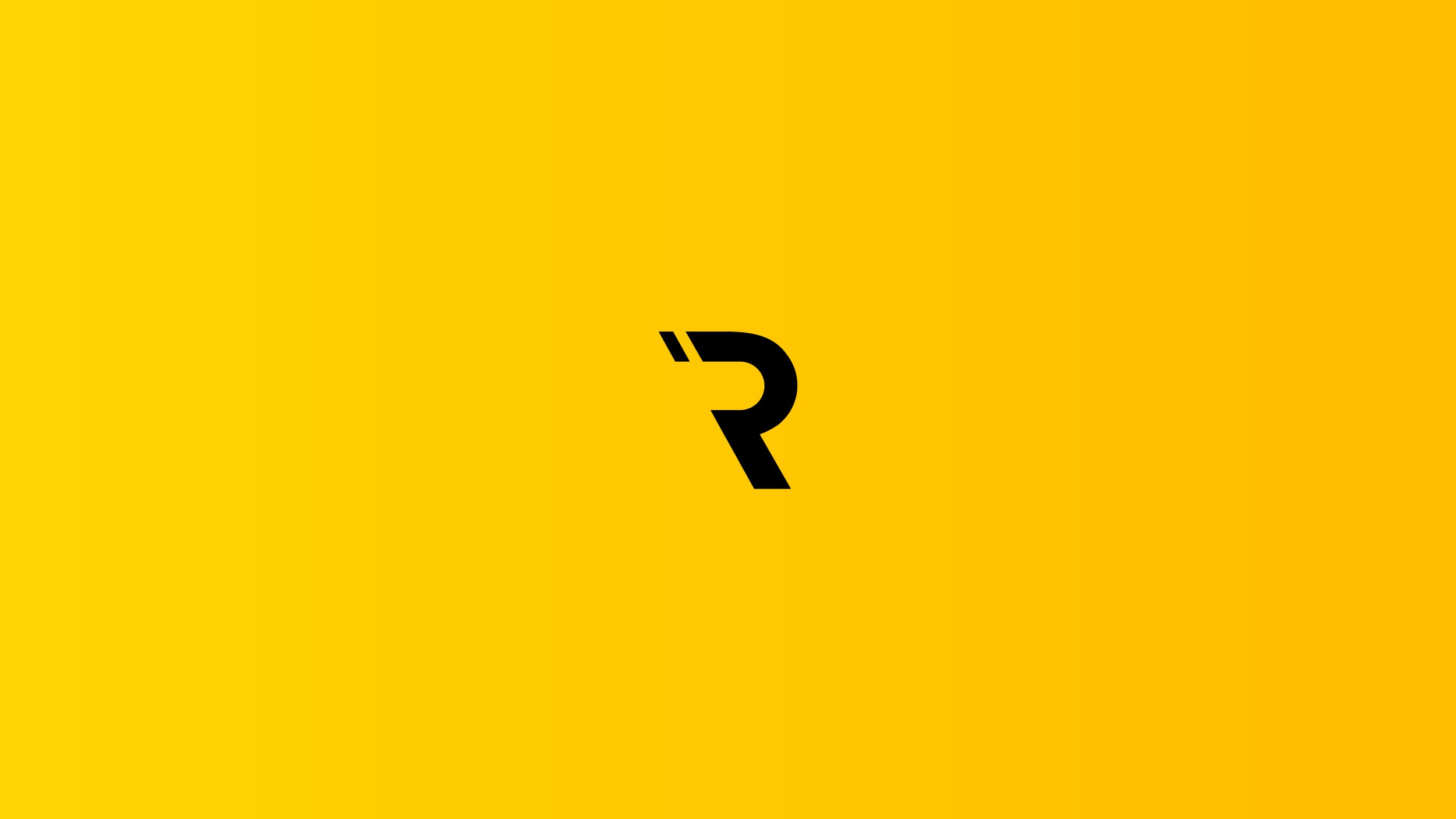
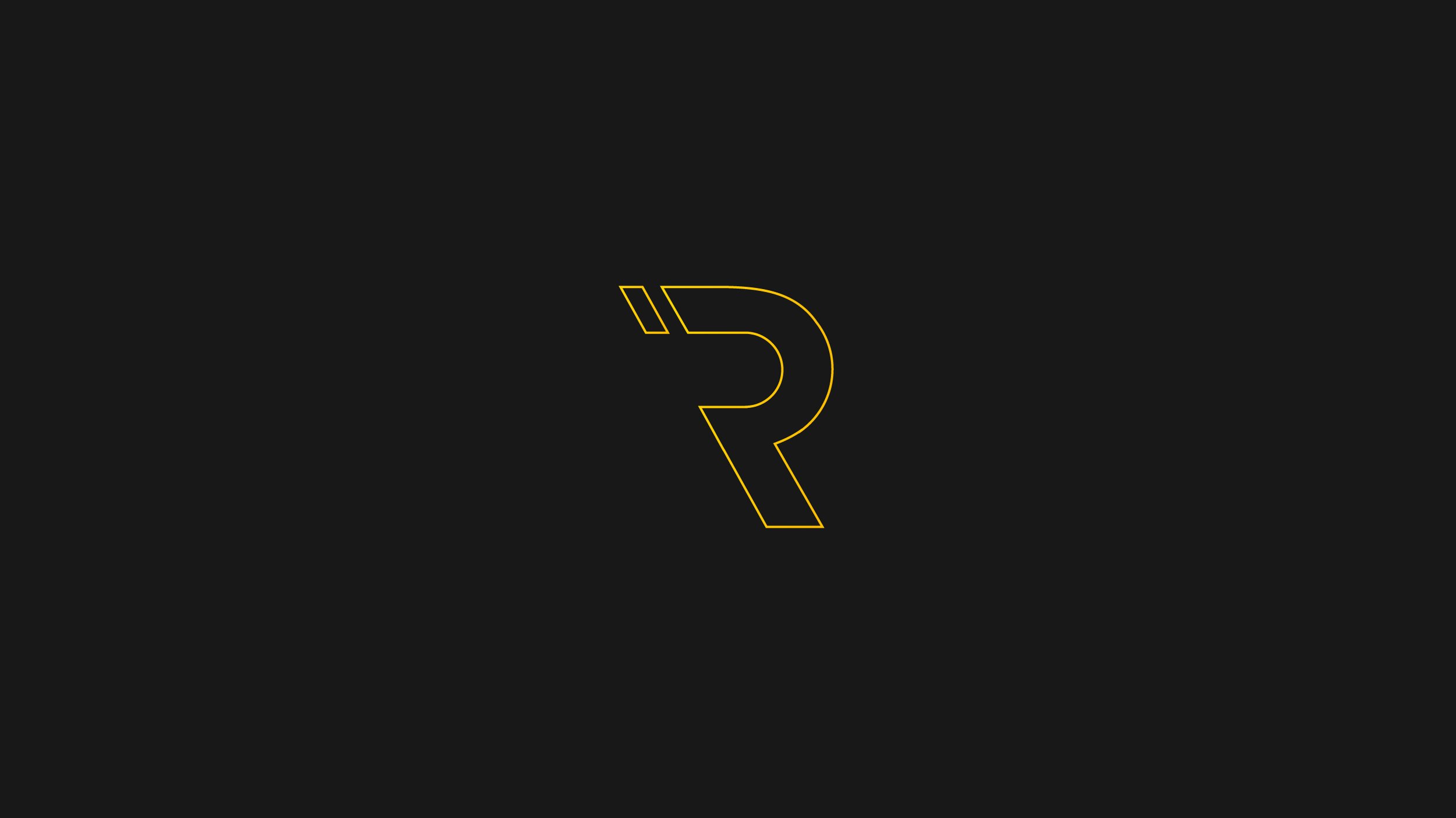
Basically, the idea behind the name “Renault Minute” stands for - fast service, done in a minute. In our proposal, we created a symbol of the letter “R” which is leaning forward, emboding the concept of movement and progress. The “minute icon” is placed behind the letter, something that alludes to - being before the Time, an avant-garde. If readed from left to right, we can understand - Minute Renault, or having a moment of quality time in French.